
AFTER
However, MISO's customers also called market participants often dealt with a maze of disconnected applications and redundant functionalities, which caused inefficiencies and higher costs.
BEFORE
ROLE & CONTRIBUTIONS
Product designer
Ideation
Visual design
Prototyping
Usability testingTIMELINE & TEAM
1 year
2 UX designers
CX manager
CX designer
OVERVIEW
The Mid-continent Independent System Operator (MISO) is a non-profit that ensures reliable, low-cost electricity across 15 U.S. states and Manitoba. It manages high-voltage transmission and a large energy market.
MISO ENERGY
Revolutionizing Energy Services through Customer Gateway solution.

SOLUTION
The Customer Gateway is MISO’s strategic solution to this problem. It aims to create a unified digital experience for authorized customers, providing them with streamlined access to essential services and insights saving time and energy.
01 USER SATISFACTION
Boosted user satisfaction by 20% with MISO’s new ecosystem design.
02 USER EXPERIENCE
Decreased 20+ platform issues enhancing the user
experience of the product.
OUTCOMES


PROCESS

01/ DEFINE THE SCOPE

MISO RESEARCH
The MISO team shared their research (7 personas, 2 Customer Journey maps) and their vision of the gateway portal.
DESIGN DECISION 01
Due to the time constraint, we choose one persona (Aiden; Market participant) to work with. As more personas can take time to focus on.

DESIGN DECISION 02
We chose Aiden persona to proceed with because it is the primary target audience and aligns with the vision.
RESULT
The ambiguity has been resolved, but the real issue was identifying why services lacked a cohesive experience.
02/ USABILITY TESTING
DESIGN DECISION 01
We did 3 direct customer interviews to understand the current UX of MISO tools and services.
RESULT
We did get to know there were many pain points associated with the product.

Usability testing was done to validate the challenges of Aiden persona. Some were “Aiden had difficulty participating in MISO markets”. The target users indeed face challenges.


PAIN POINT 01
There is no seamless process to becoming
a market participant.
PAIN POINT 02
No real-time insights about different entities in the MISO dashboard.
PAIN POINT 03
Providing more login/ out options with intuitive reporting will enhance UX.
03/ COMPETITOR ANALYSIS
DESIGN DECISION 01
We did compare with other players similar to MISO to understand their UX with services they provide.
RESULT
We did consider the insights and Implemented them in low fidelity screens.


Competitor analysis was done to understand other operators and compare MISO tools/ services.
04/ LO FIDELITY & TESTING
DESIGN DECISION 01
We ideated for the new market participant onboarding flow
and a dashboard for the gateway portal.
RESULT
It helped in eliminating redundant steps of onboarding flow and ideating scenarios for different services.


WIREFRAMES
Lo fidelity was done to bring the unified experience vision of the Customer gateway portal to life and eliminate the disconnected applications/ portals.
DESIGN DECISION 02
We did preliminary testing to validate lo fidelity screens with the product team of MISO and stakeholders.
RESULT
We uncovered some missing features in the dashboard.

This testing was done to have better client communication about the design decisions and for faster iteration.
INSIGHT 01
The team requested a better onboarding process.
INSIGHT 02
The team requested a new resources page with additional functionalities.
INSIGHT 03
The team requested the feature of downloading resourced data.
05/ HI FIDELITY & TESTING
DESIGN DECISION 01
Designed hi-fi screens of new resources screen, a help center and a new registration process.
RESULT
Better collective view of resources, faster way of communication and easy onboarding of users.
NEW RESOURCES PAGE
Gives the flexibility to have collective view, downloading and compare resource data, reach out to MISO team easily.

RESOURCES PAGE
OLD HELP CENTER
Lacked the functionality of easier access with the MISO team and raising tickets to the team or view them.

OLD PAGE
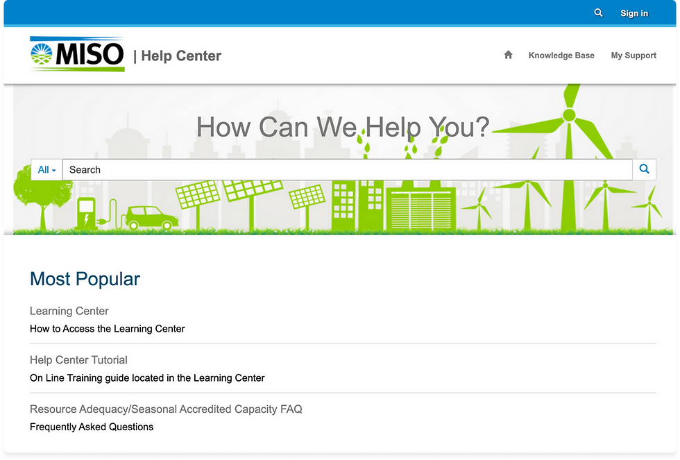
NEW HELP CENTER
It is integrated in the gateway portal and solves issues with the old one.

NEW PAGE
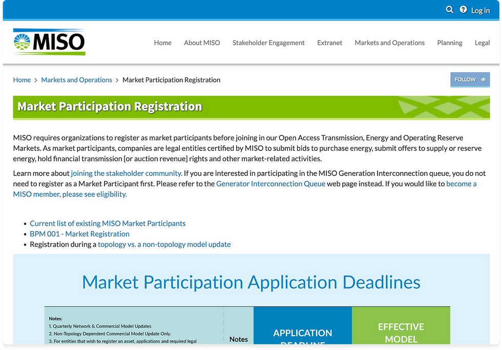
OLD REGISTRATION PAGE
Long and redundant steps of registration frustated the users (market participants).

OLD PAGE
NEW REGISTRATION PAGE
It has 5 step process with upcoming deadlines for each step makes it easy.

NEW PAGE
DESIGN DECISION 02
We did secondary testing to validate hi-fidelity screens with the MISO customers and their product team.
RESULT
After the testing, Client and users requested 3 features to be on the dashboard.
FEATURE 01
Filtering the tickets at the Help center.
FEATURE 02
Quick way to access the business practice manuals.
FEATURE 03
Customized user notifications for addressed service requests.
RESULT
The client was happy with the new iterations and we successfully delivered it!
06/ REFLECTIONS
01 USABILITY SESSIONS
usability sessions helped in validation of the designs as the client was not sure about the high level information that needs to go in the gateway portal.
02 IDEATION
The ideation phase was challenging to understand the previous research insights as a whole with a company with a large portfolio.
03 FEASIBILITY
effective communication of design decisions with non-design stakeholders is necessary for a better outcome.
WHAT WOULD I DO DIFFERENTLY ?
Additional time could have offered opportunities for better service design of the product ecosystem.
Next cases
Check out other case studies.

Play a Game
Box Shooter
Design and dev by me.


