_gif.gif)
AFTER
SOLUTION
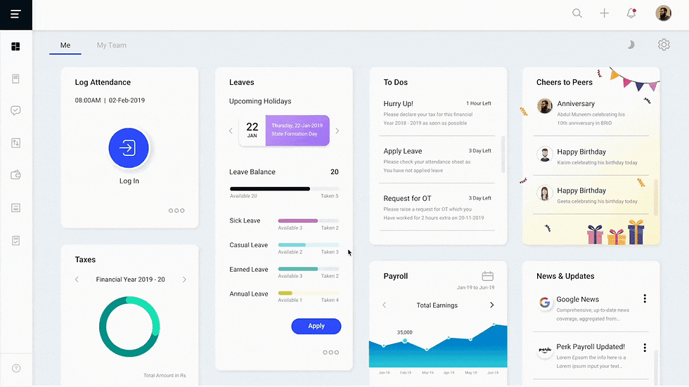
Restructured the IA and developed a clear, intuitive navigation system to reflect Brio Technologies' value proposition: the best HR-friendly payroll system. This created a dashboard that is both easy to use and enjoyable.

BEFORE
ROLE & CONTRIBUTIONS
UX designer
Information architecture
Competitive analysis
Visual design, PrototypingTIMELINE & TEAM
8 months
CEO
Product manager
UI developer
OVERVIEW
Brio’s product was struggling with low user satisfaction. Users found the dashboard navigation unclear, and the poor information architecture (IA) led to an unpredictable experience, ultimately affecting sales.
BRIO TECHNOLOGIES
Redesigned payroll dashboard and boosted 30% in sales.

+30% IN SALES
6 in 10 users bought the product compared to 3 in 10 before.
+40% IN SATISFACTION
8 in 10 users were happy with the redesign compared to 4 in 10 before.
OUTCOMES


REDESIGN PROCESS

01/ USABILITY TESTING
END USERS EXPERIENCE
Employees expectations
did not meet.
DESIGN DECISION 01
We did usability testing to understand why the dashboard did not meet user expectations.
RESULT
There were 3 usability issues in the current dashboard.
ISSUE 01
The attendance option repeated two times causing ambiguity.
ISSUE 02
Unclear features which might not be used by the users.
ISSUE 03
No Login/log out option and other similar features which makes dashboard not intuitive


INFORMATION ARCHITECTURE
DESIGN DECISION 02
Organized the current information architecture to address issues with hierarchy and navigation.
RESULT
There were 3 pain points in the
current information architecture.

PAIN POINT 01
IA had miss-structured content in the application.
PAIN POINT 02
The admin roles of the application were mixed in the same level of normal employee role.
PAIN POINT 03
It was hard for a user to find his necessary features.
DESIGN DECISION 03
Based on the pain points, employees
are categorized as Manager and Admin to access dashboard features.
MANAGER
Managers as an employee can view
all his team’s information.
ADMIN
Admin like a CEO of a company has access to all employee’s
information.
DESIGN DECISION 04
Identified two key redesign challenges impacting user expectations.
REDESIGN CHALLENGE 01
Develop a new Information Architecture by defining employee roles.
REDESIGN CHALLENGE 02
Redesign the dashboard interface for easier feature access.
02/ SOLVING THE CHALLENGES

NEW IA
After collaborating with the manager and team, we did 3 iterations of the IA and came up with the one with clearly defined roles for the employee.

DESIGN DECISION 01
Dashboard’s resources are categorized as Me, My team and Admin tabs.
RESULT
Clear Information Architecture solved the 1st challenge to defines roles.
ME TAB
Employees can access his info under this tab.
MY TEAM TAB
An employee in manager role can view all teams information.
ADMIN TAB
The admin tab provides access to company payroll and team info.
DESIGN DECISION 02
We conducted competitive research to identify features for our new dashboard design.
RESULT
Insights from competitive research
were used to create wireframes for
new dashboard.

INSIGHT 01
Perk payroll has to have structured payroll process.
INSIGHT 02
Providing more login/ out options with intuitive reporting will enhance UX.
03/ DESIGN ITERATIONS
DESIGN DECISION 01
Wire-framed ideas and received feedback from the client for iterations.
RESULT
The finalized idea included all essential dashboard features for the user.

EMPLOYEE DASHBOARD
ITERATION DECISION
Wire-framed ideas and had multiple feedbacks from the client for iterations.
RESULT
The finalized idea included all essential dashboard features for the user.


ITERATIONS


MANAGER DASHBOARD

ITERATION DECISION
Iterations were done by adding Leave requests and other team members information to the dashboard.
RESULT
Solved the challenge of intuitive reporting and better access features for manager role.
04/ REFLECTIONS
01 DIVERSE SCREENS
Designing 35-40 screens for each profile was a rewarding challenge that greatly enhanced my learning and experience on the project.
02 PROJECT TIMELINE
Despite the tight timeline, I efficiently delivered, learning to prioritize and adapt.
03 DESIGN LEADERSHIP
As one of two designers, I led design decisions and communicated strategies with the client, enhancing my leadership and collaboration skills.
WHAT WOULD I DO DIFFERENTLY ?
Additional time could have offered opportunities for deeper research and design refinements.
Next cases
Check out other case studies

Play a Game
Box Shooter
Design and dev by me


